Orvos
2022
UI/UX
Hackathon
Tools used
Figma, Figjam
Contribution
UI/UX Design, Visual Design, Video editing
Research
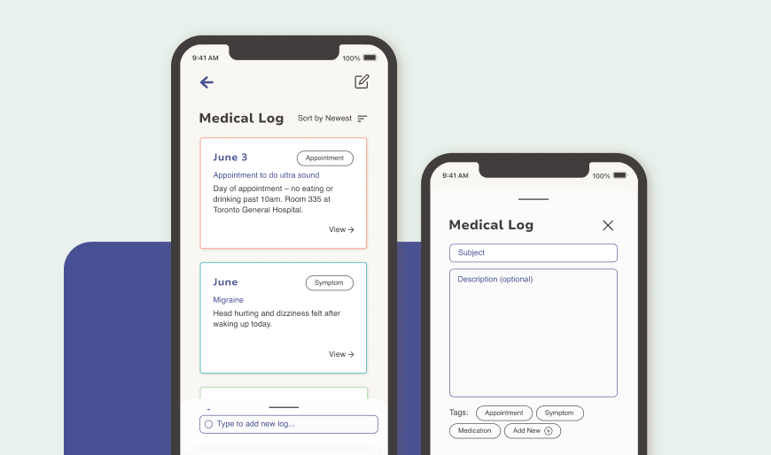
According to Reaction Data, “21% of health professionals reported filing Electronic Health Records were a primary source of stress. 34% stated that this could be alleviated through an improvement of user friendliness.”

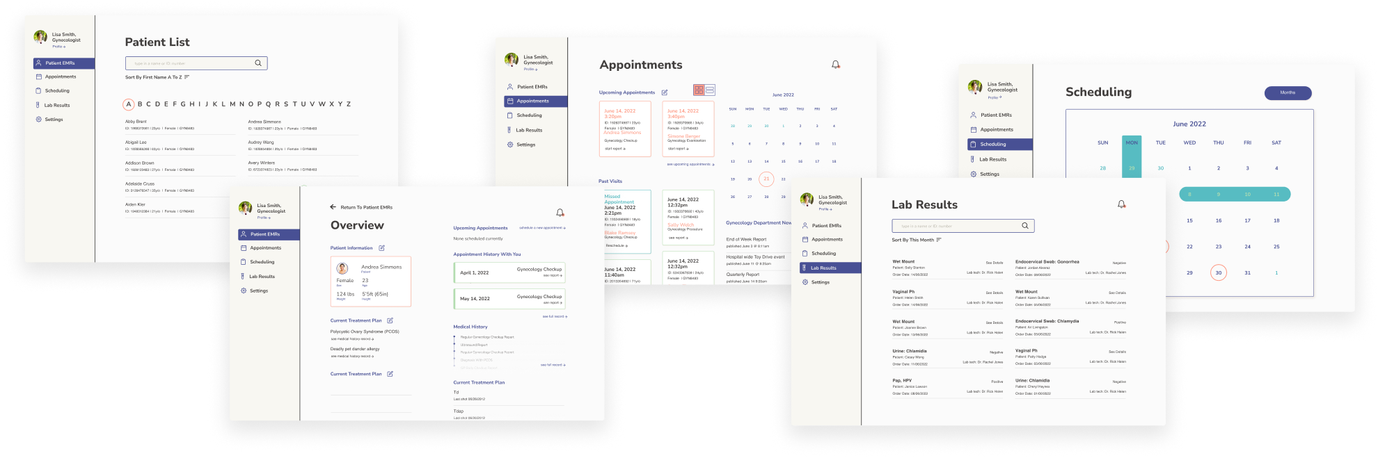
Based on a SybridMed article and our own discussions the group identified 3 main pain points.
Less sector specific software
Without a program that supports specific sectors in healthcare (cardiologist vs dentist vs hospital residents) there is less support for the specific needs between each healthcare practice.
EMRs Are complicated
With less user friendly interfaces, it can take additional effort and personnel requiring additional time needed to learn and navigate.
Patients can feel in the dark
Communication between doctors and patients between appointments can be difficult especially if the doctor lacks time for many appointments.
As points are each complex on their own, as a group we aimed to primarily target improving the interface and considering how to converge doctor-patient communication and information as well as other possibilities within the same application within a specific niche in healthcare. With our app specifically, we considered how such an app can be used at a hospital for both practitioners and patients.

We identified different competitors and identified the services they offered, and noted that features tended to focus more on the practitioner side as well as didn’t reliably allow easy post appointment communication between the practitioner and patient.
After we brainstormed different task flows between patients and practitioners considering the requirements of what each page should contain and do based on the areas that the competitors lacked. We also determined we would create two different flows, one for a practitioner to target workflow inefficiencies and patient communication, and one for a patient to schedule and to have a log of their appointments.
Patient sided Mobile App
Home Page
A place for patients to view and manage upcoming appointments.
Medical Log
A log that allows patients and practitioners to document a medical timeline to make your next appointment more streamlined.
Profile
An overview of important health information that can be referenced by the patient.
Scheduler
Patients can block out unavailable dates and set preferences for their next appointment date.
Patient sided Mobile App
Patient List
A page for practitioners to view, search and manage patient EMRs.
Overview Dashboard
An overview allowing patient profiles to be displayed at a glance based on upcoming appointments.
Appointment History
Another dashboard containing a calendar and upcoming view of past and upcoming appointments.
Scheduler
A scheduler for practitioners to easily timeblock their schedule and have the next appointment easily set with their patients.
Lab results
A searchable database for lab results and potentially other documents based on area of practice.
Takeaways
During the short span of the hackathon, the team focused on designing not just for a specific client, but on researching and understanding user needs and current issues. Our goal was to improve EMRs and create a patient-facing version to enhance patient access to health information, benefiting both patients and healthcare providers. This experience highlighted the need for further research and user studies, and opened up new areas for applying design thinking in healthcare and other industries. I'd like to revisit this topic in the future, especially with more industry insights and deeper user research.