Kazoo is an app that is designed to alleviate stressors related to childcare, streamlining the process of finding activities that are suitable for moderate supervision.
Problem statement
During the pandemic, there has been demand for resources to alleviate the stress resulting from the increased need to care for children.
Our Solution
Drawing from my groupmate’s experiences with childcare and the responsibilities surrounding the supervision of children, my group and I created Kazoo. Our an application tailors activities and content according to the age and interests of the child that is either using the app or for a guardian to choose on behalf of their child.
Understanding the User
“...if we [...] could organize our reminders based on types of categories [...] based on maybe something for the home, something for, like, appointments, something for school [...] maybe that could keep a little bit more organized.”
~ Participant 3
Ethnographic Research (AEIOU)
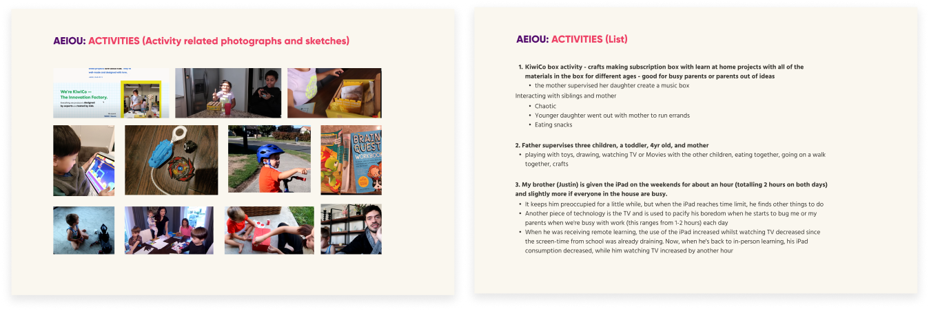
First, my team conducted multiple rounds of research, first using the AEIOIU (Activities, Environment, Interactions, Objects, and Users)method to create a framework to take notes on different aspects in their environment. With this mothed we noticed that often in family settings, for younger children, finding tasks to keep children engaged that allows for light supervision can be time consuming, and running out of ideas for activities seems to be a common struggle for parents and caregivers.
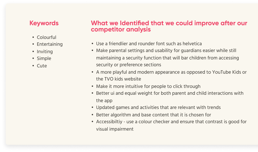
Then, we each chose 3 main competitors, TVO Kids, Youtube Kids, and Khan Academy Kids, to analyse using the principles of Usability Goals, User Experience Goals, and Usability Principles/ Heuristics. In each category, we selected 3-4 examples to rate and provide justification. We underwent this process in order to gain more context about what is being currently done in the field of education and entertainment for children in a safe and educational space. Overall, we felt like there were some outdated graphics, issues with immersion, as well as less support for children’s creativity and parental guidance.
After understanding and going through various exercises to understand our users, we considered different options and directions, assembling a moodboard and considering design choices that would fulfil key words such as “friendly” “age-appropriate” and “engaging” were fulfilled with our design and user experience.
Tasks & Requirements
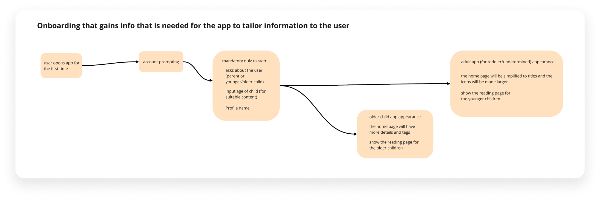
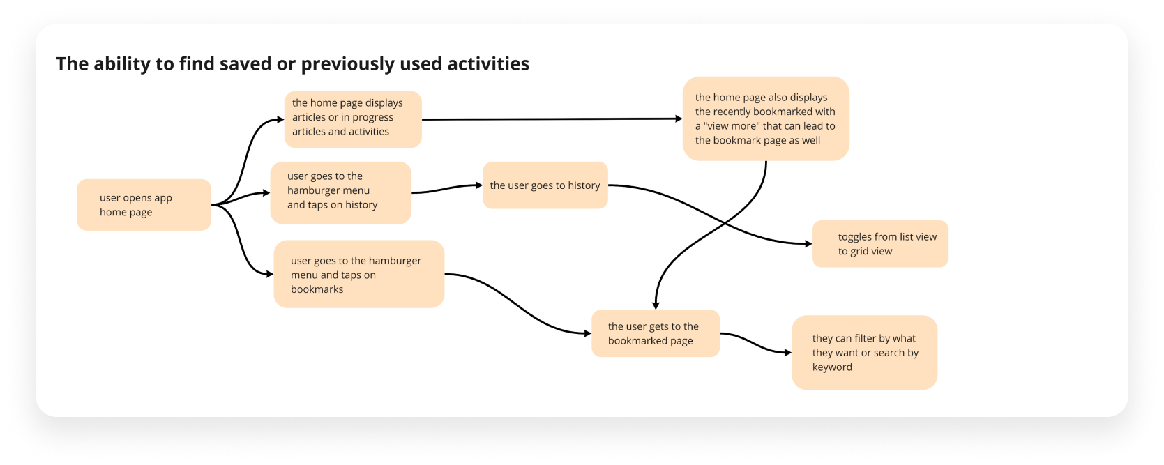
Based on the scenarios we constructed potential different use cases of our application. As a group we discussed and considered ways that user flows and the components of user flows can fulfil the needs. We created 12 rough task flows based on our identification of different needs presented by the different scenarios as an exercise to work out what may work best for our final user flows
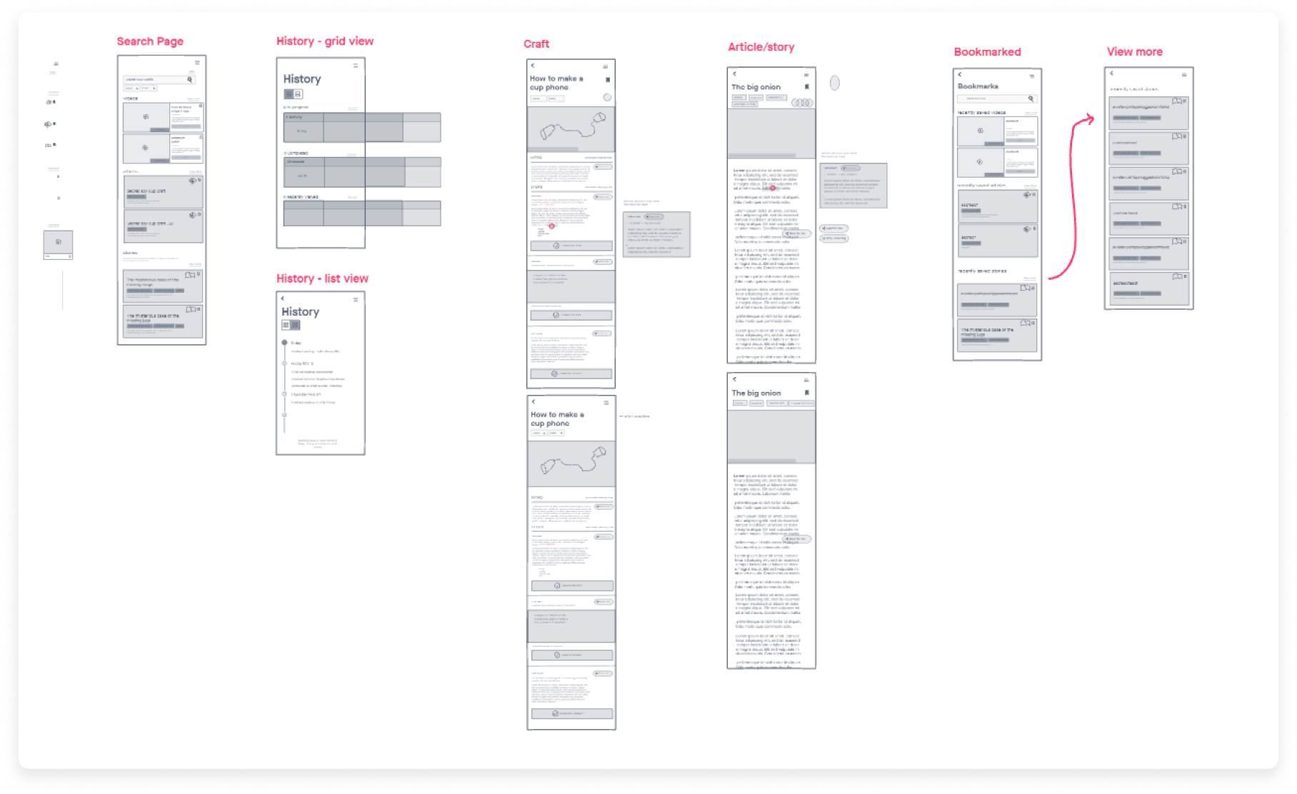
Wireframing
After moodbarding and discussing possible organization logic for each of our pages, we delegated different pages to lay out. We discussed our rough page designs, and referenced existing UI. We similar concepts such as the ability to tap on an unfamiliar word to find a definition similar to ereaders or ereading applications. Using our user flows as a guideline and editing flows when needed, we strove to ensure that things were fun yet still utilising familiar structures and interfaces found on other apps for easier learnability.
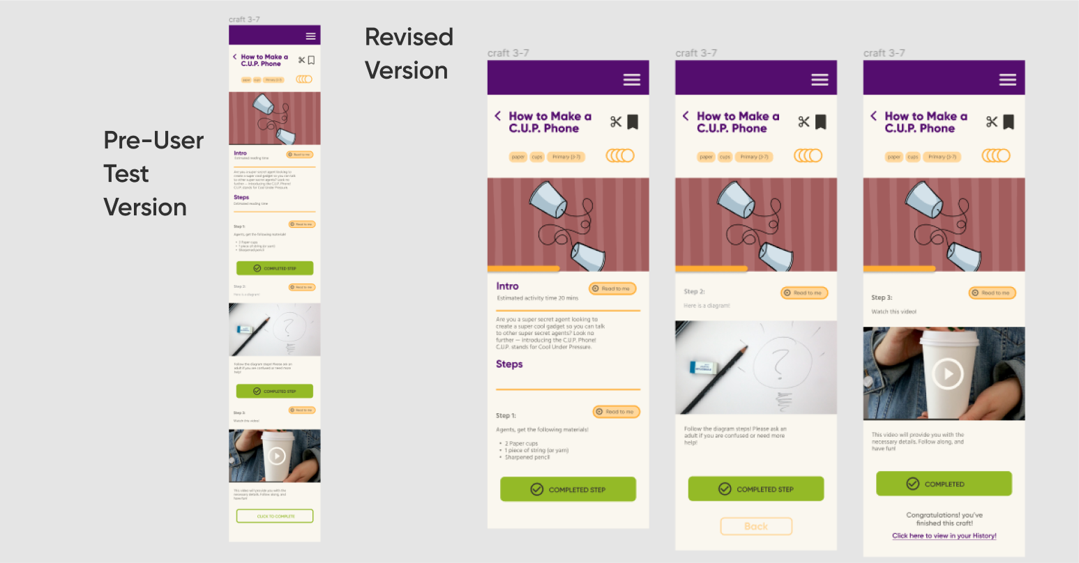
After wireframing, we developed our pages into high fidelity wireframes and refined them to be suitable for user testing. After this test, this informed the changes to our app design. Key realizations after this test included:
1. Improving some buttons that were not easily discernable to be clickable 2. Improved the search function and realized our mistakes when prototyping which caused much confusion during the test- we learned that the fidelity for the next user test we conduct should have been much higher 3. Edited the visual organization of the activity page from scrollable to navigateable pages
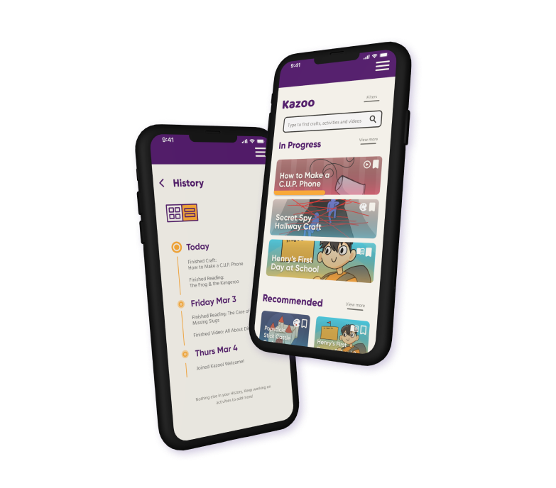
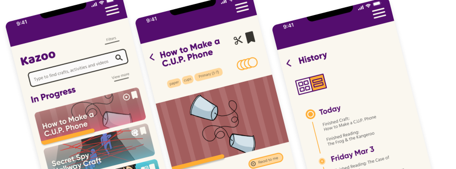
Final Prototype
Takeaways
Feedback is Always Valuable
After completing this lengthy process of creating an app from problem statement to full fledged prototype, I learned a lot about working with a group of designers and with user research. Especially with having assumptions validated or to be proven wrong, being able to bounce back and discuss to make changes was a very constructive and enlightening process. This being the my first process of designing an app with UX research, I found this to be a very wonderful project to learn especially from all the feedback I got from the course TA as well as from our research. Special thanks to Dan Silvera for giving us great feedback at each stage!
There is More I Can Learn About Information Hierarchy
As something to improve, I realize this app design wasn’t visually as well designed as I would like as it seems to still miss some cohesiveness for functions and interactions. Alongside designing information and useful tools for children, after taking stock of what was out there for children to learn currently, I realize that if given the opportunity, I would really hope to continue to learn and improve upon this preliminary app build through visuals but also with more knowledge to create better UI and Information hierarchy.