Orvos is an app designed to alleviate stressors that are encountered by both patient and healthcare practitioner for a more streamlined experience.
Problem statement
How might we alleviate the stressors relating to filling out EMRs as well as patient experiences surrounding healthcare practices?
Our Solution
Inspired by a podcast episode by Wireframe surrounding bad design within healthcare and service industries, we decided to create an app that targets both patients and doctors as the primary demographic in order to create an overall better user experience for both professionals and patients all around.
Understanding the User
“21% of health professionals reported filing Electronic Health Records were a primary source of stress. 34% stated that this could be alleviated through an improvement of user friendliness.”
SybridMed also details some pain points regarding the current system:
Without a program that supports specific sectors in healthcare (cardiologist vs dentist vs general practitioner) there is less support for the specific needs between each healthcare practice.
Training takes additional effort and personnel and requires additional time before the system is deployed and while it is deploying
Ineffective communication between the IT vendor of the EMR resulting in a lower ability to meet the needs of the users
As three of these points are each complex on their own, as a group we aimed to primarily target improving the interface and considering how to converge doctor-patient communication as well as other possibilities within the same application within a specific niche in healthcare. With our app specifically, we considered how such an app can be used at a hospital for regular patients.
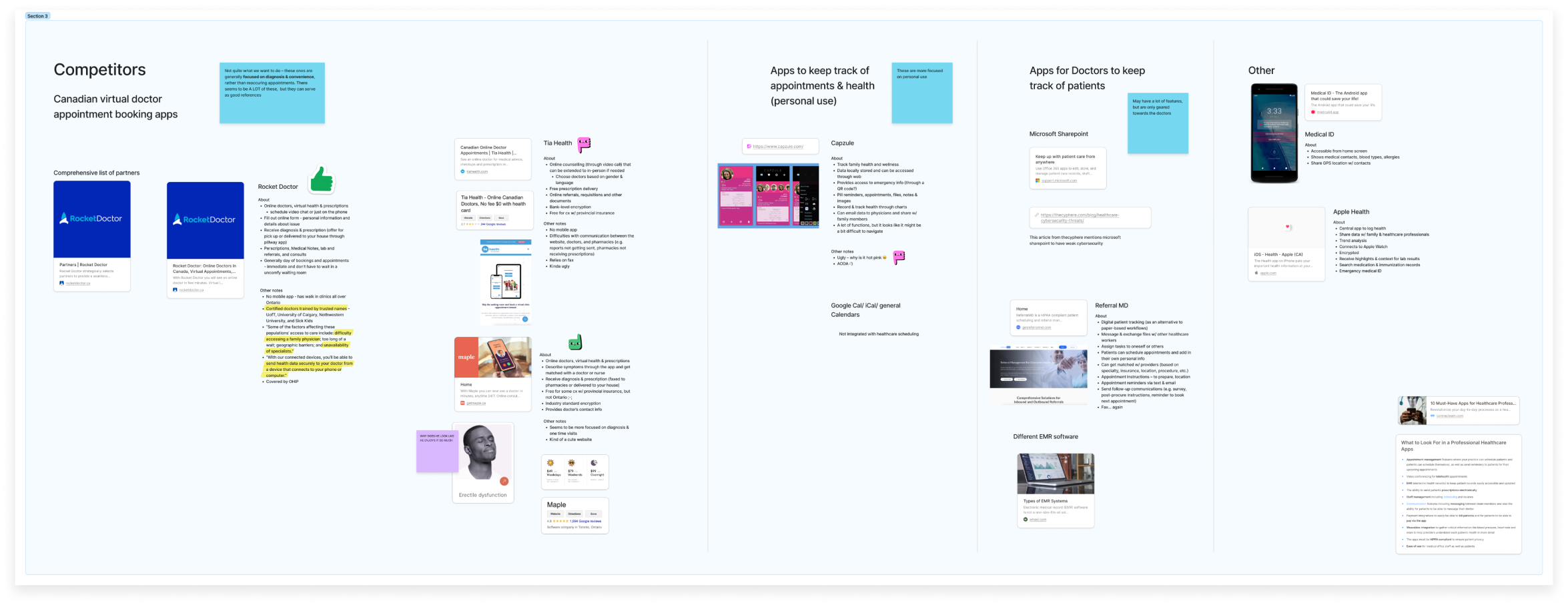
Competitor Research
We identified different competitors and sorted them into different categories including appointment booking apps, apps for tracking health and appointments for personal use, apps for doctors to keep track of patients and other apps relating to logging medical identification. Other than referencing the general actions users could complete within the app (contacting doctors, storage of treatment plans + prescriptions, appointment reminders, data safety etc.) we also looked at any potential pain points or inefficiencies. We also noted any user interface details whether the styles were compliant with accessibility as well as being simple to use.
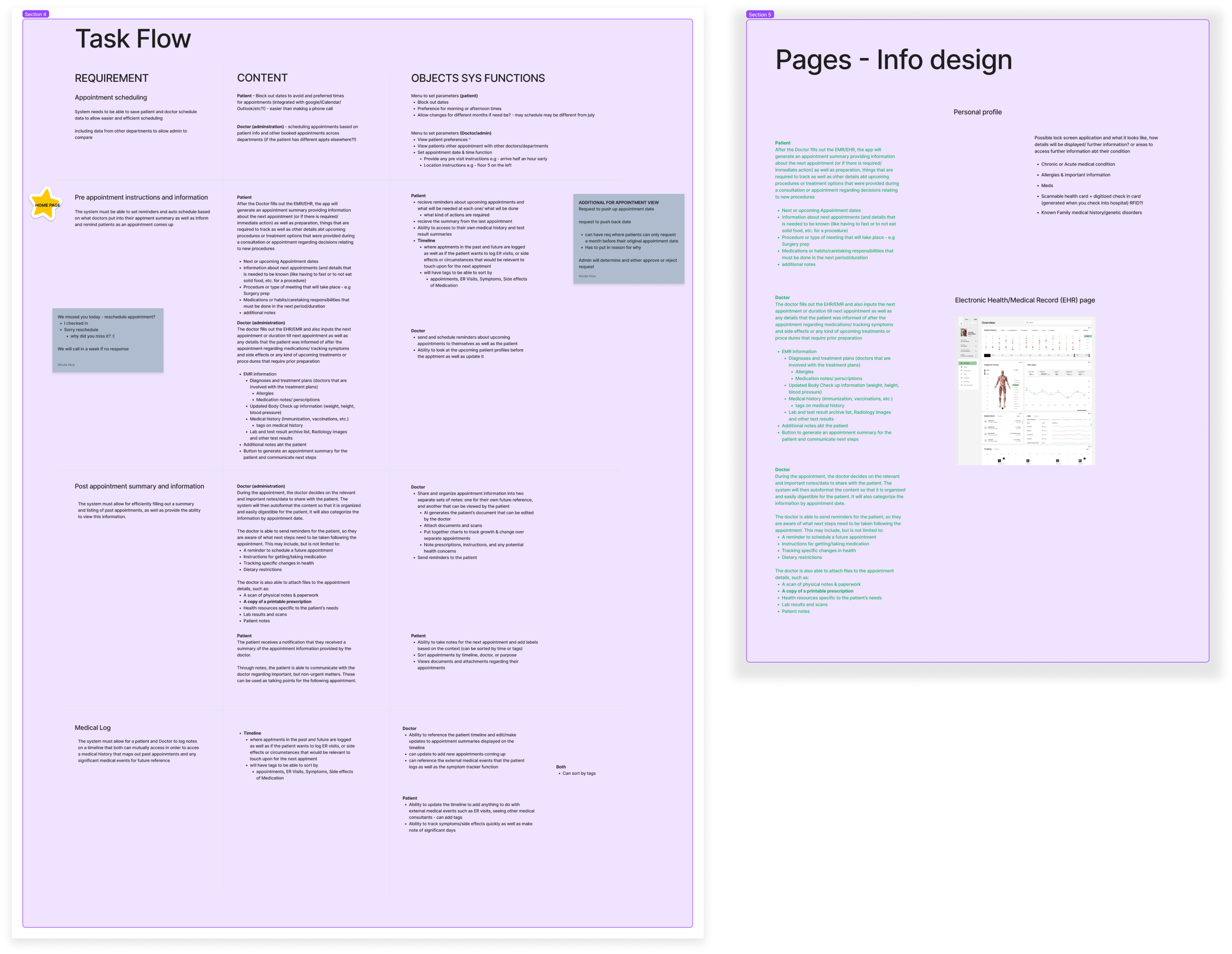
Task flows & Information design
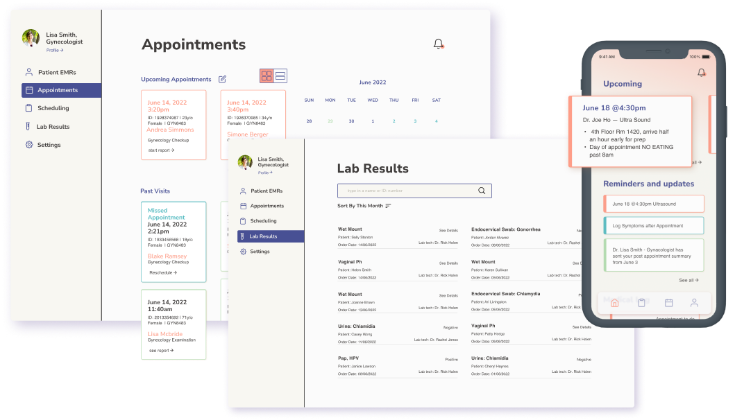
After our research we then considered and identified key tasks flows to highlight within the app. We focused mainly on basics including patient ended display of data as well as the healthcare professional side with an EMR listing, test results, as well as scheduling appointments.
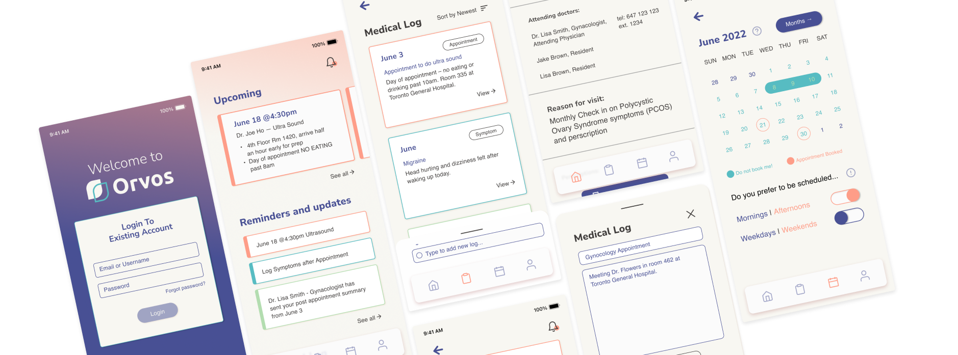
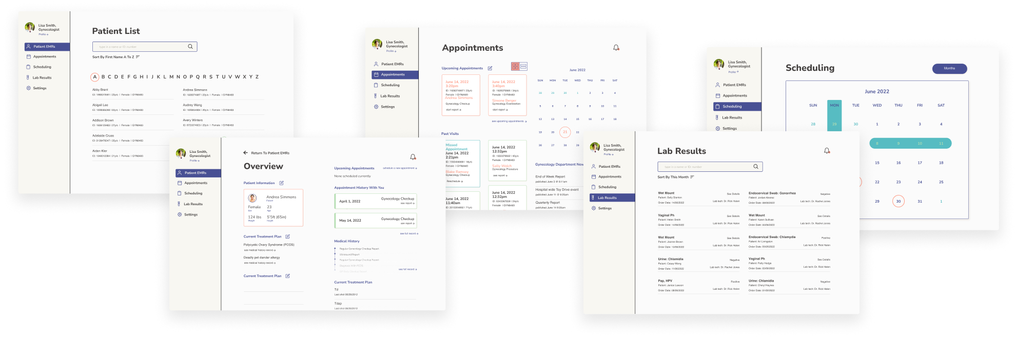
With EMRs being a densely packed source for information, ensuring that all necessary information is listed in the most simple and logical way was our priority. We thought about everything that is currently listed. Referencing current EMR programs, we considered how information could be rearranged in a way to be a brief overview with access to detailed lists when needed.
Understanding the User
Being aware of the requirements and tasks to streamline an EMR filling process as well as communication aspects with patients, we set out to design something to align and contain the information that we saw in EMRs in our research.
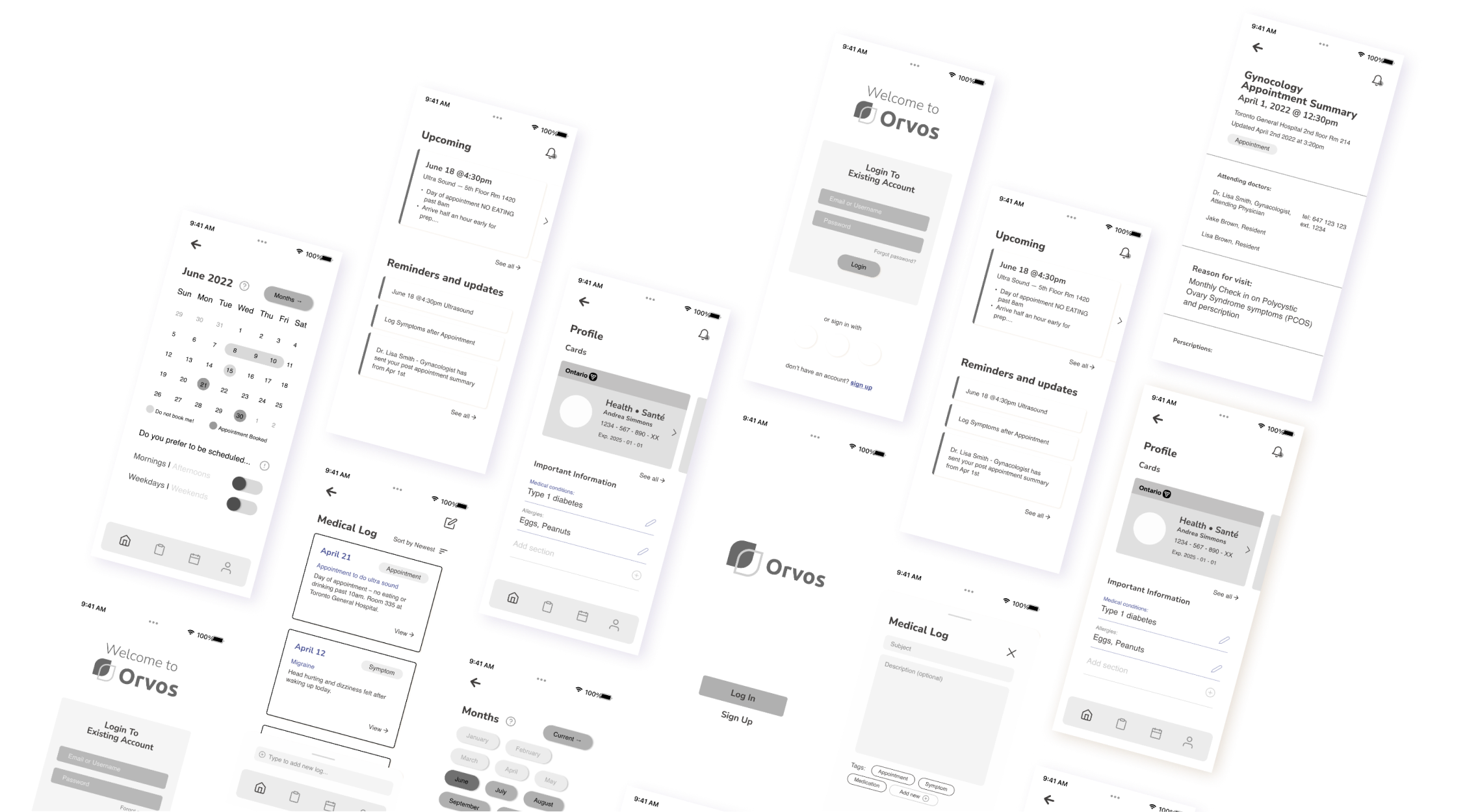
Wireframes
Patient sided app
Healthcare Practitioner Sided Webapp
Takeaways
Hierarchy is your best friend
As healthcare documentation is complex and full of important details, we were also challenged to design for the ability to look at and document information. We were challenged with determining what was important information and determining the hierarchy.
Analyzing current systems is a great way to learn
Often design isn’t meant to reinvent the wheel but instead to improve the wheel. In our case we wanted to improve EMRs as well as provide a sort of EMR for the patient as well. Having been patients ourselves, we discussed the importance for patients to be more informed and have easier access to their health information, and at the same time, allowing both ends of the healthcare workflow to benefit from designed information systems.